I took it upon myself to plug some knowledge gaps and dove in with Mike Fredericks and the School of Motion's 'Design Kickstart' course. Mike is an Emmy-Award winning Designer & Art Director who has been working in the field of Motion Design for over 20 years. His roster of advertising and broadcast clients is massive and includes some big names like HBO, Discovery, National Geographic, and Microsoft.
In Design Kickstart, I took on industry-inspired projects while learning key design concepts that will hopefully elevate my design work right away. The goal is to have all of the foundational design knowledge necessary to start crafting storyboards that are motion ready.
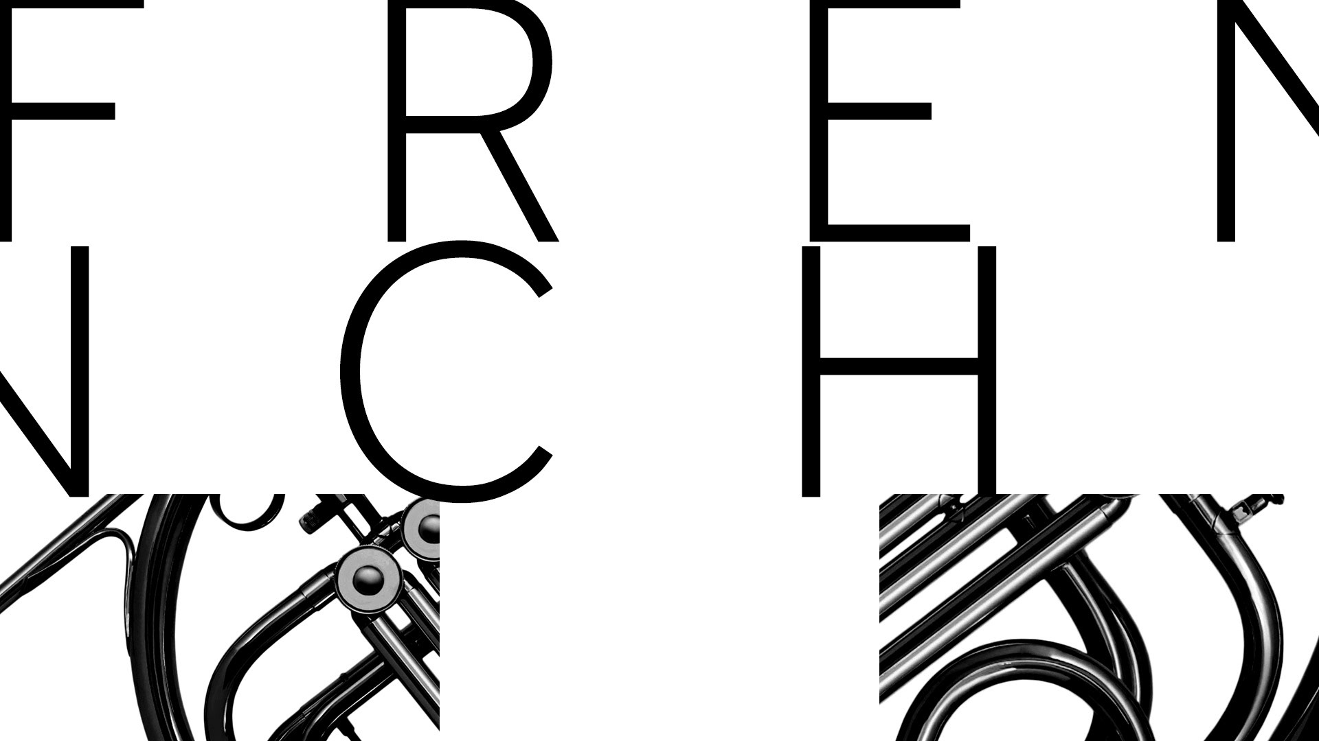
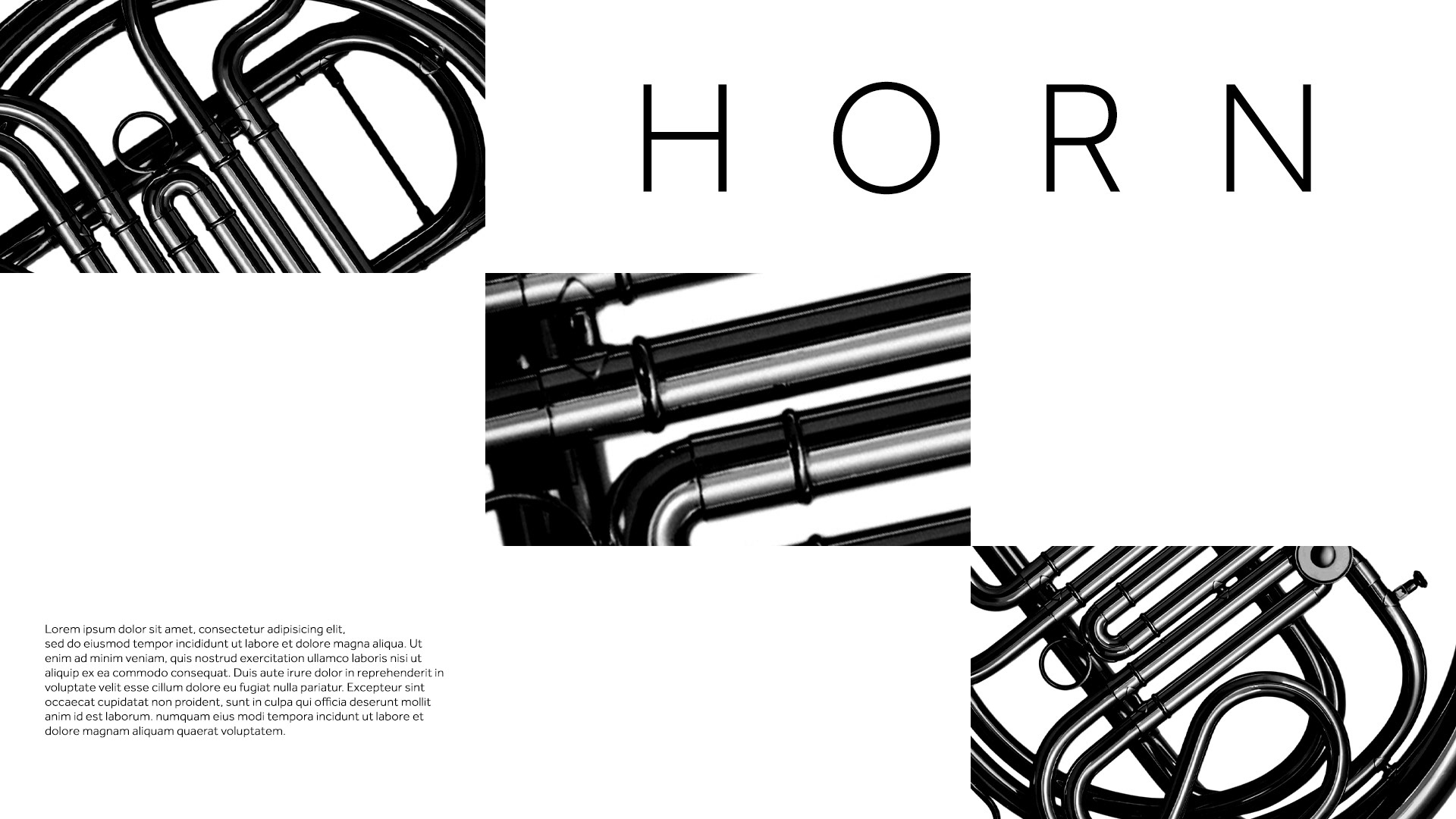
The first week concentrates on learning to see like a designer and the exercise was to train the eye to distinguish a good composition through abstraction and simplification. The branding elements consisted of a single image of a french horn, typography (2 fonts), and a simple colour palette of black and white. In short, create 4 design frames that create interesting positive and negative space relationships using a 3x3 grid of "viewfinder" windows.


The next step concentrated on the very important role of contrast in composition through the use of positive and negative space. The assignment -
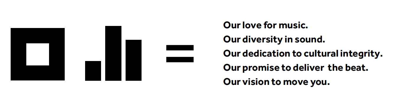
Create design frames for our mixx logo animation.
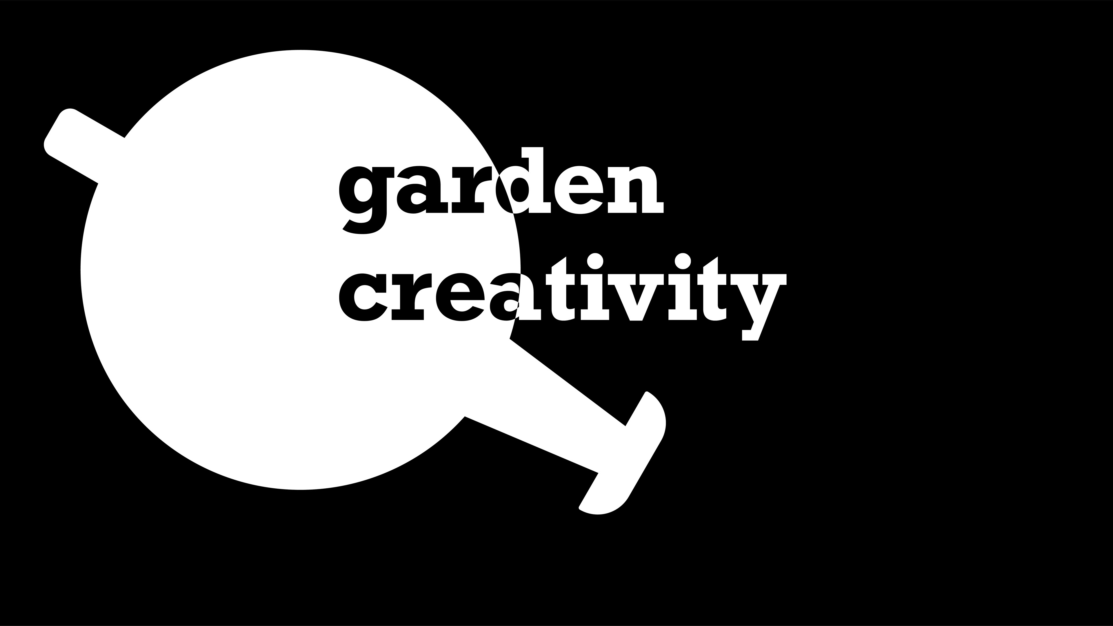
They wanted six design frames that used their visual voice and branding elements to express the awesomeness of music and core values of their brand. This logo animation will be used on multiple platforms and seen in many places. Clean and harmonious is the vibe they were going for. So here's those visual elements:
And here are the design frames that I came up with.


And to consolidate one's understanding of these design principles, another assignment -
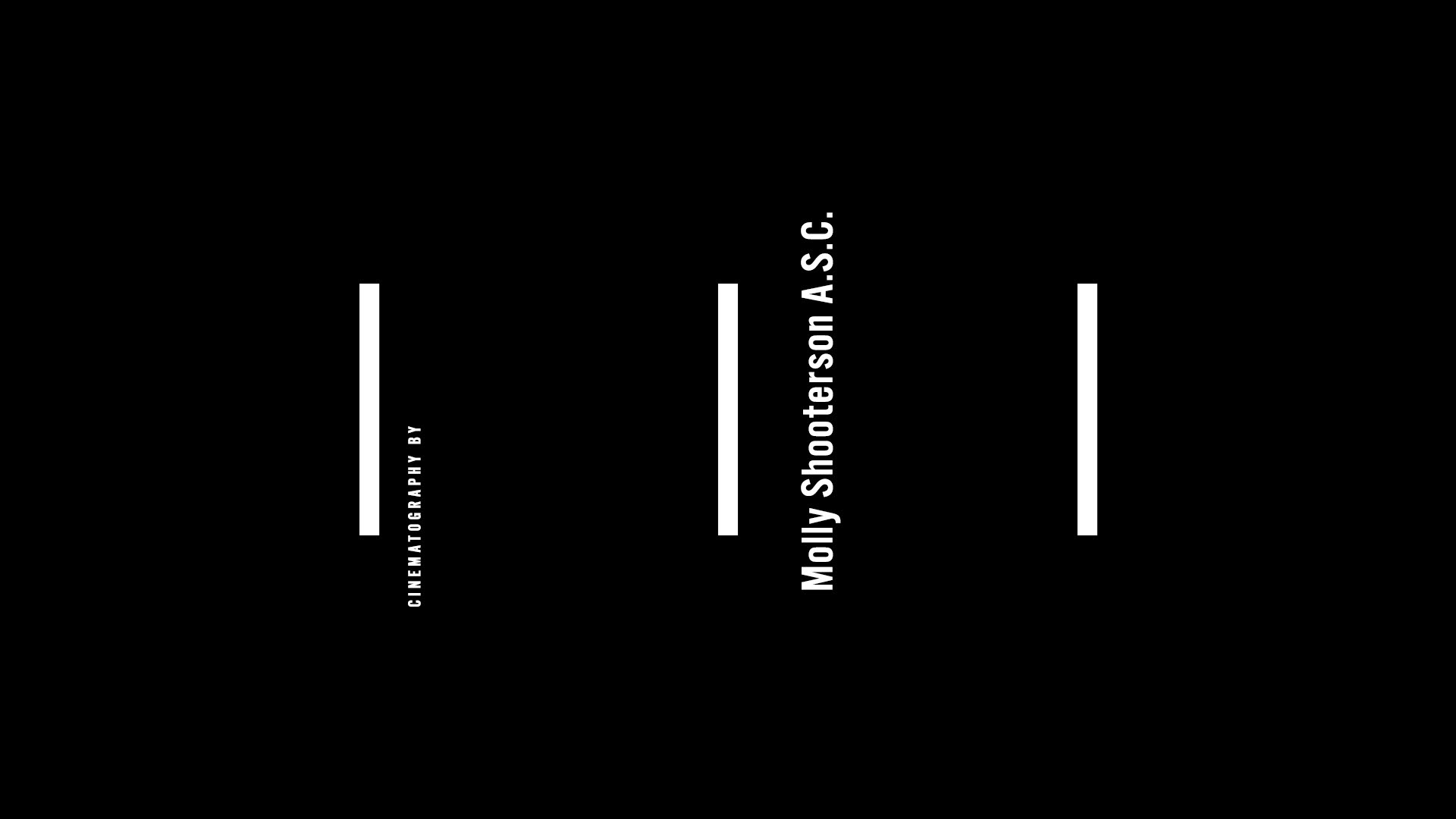
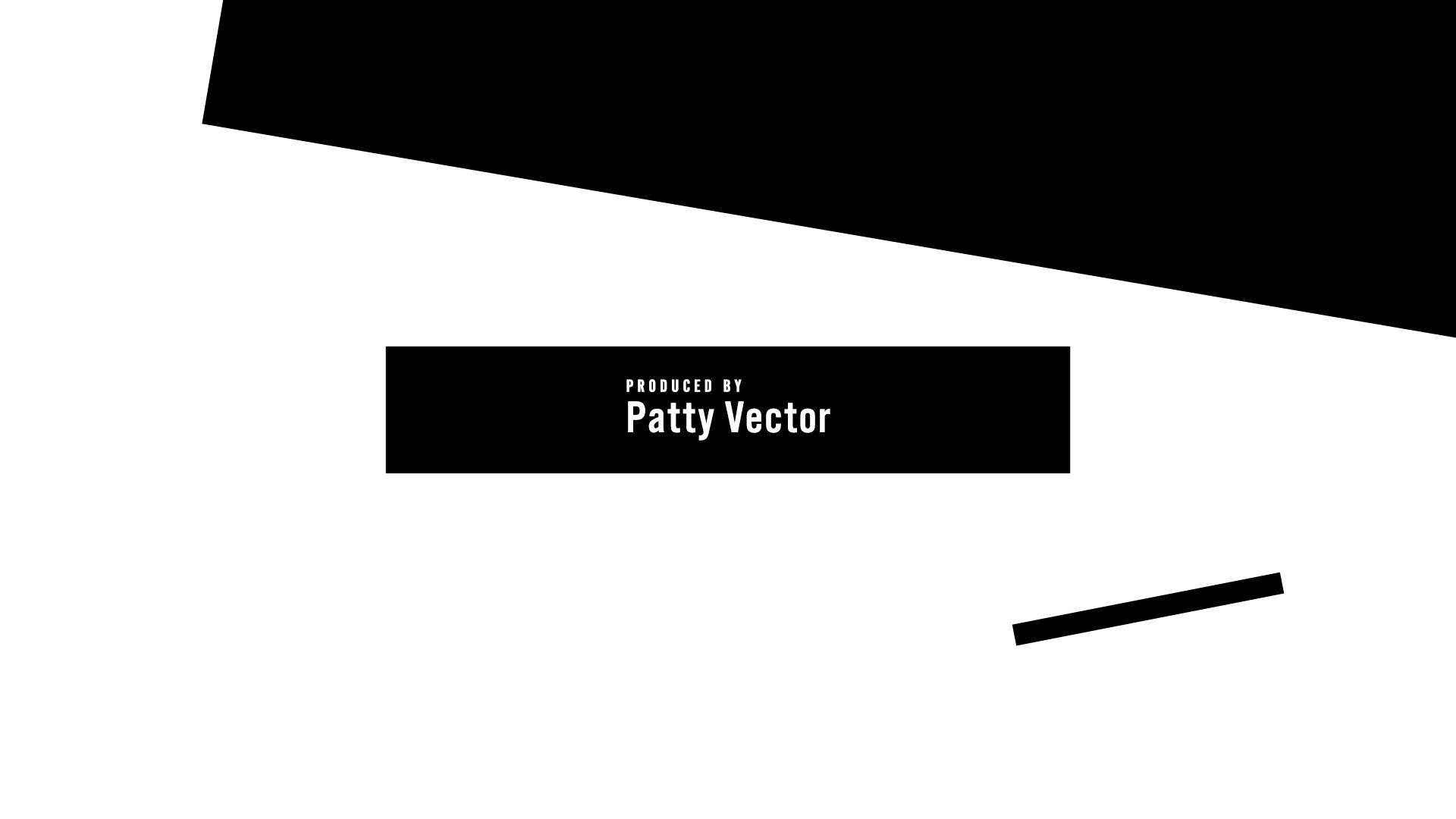
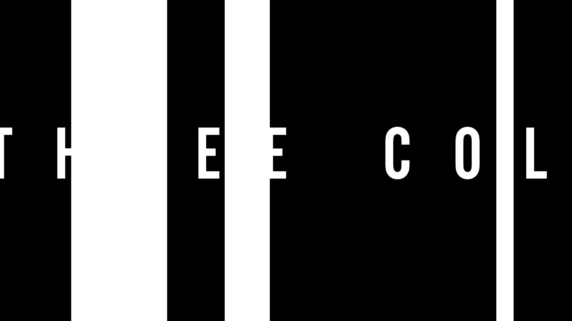
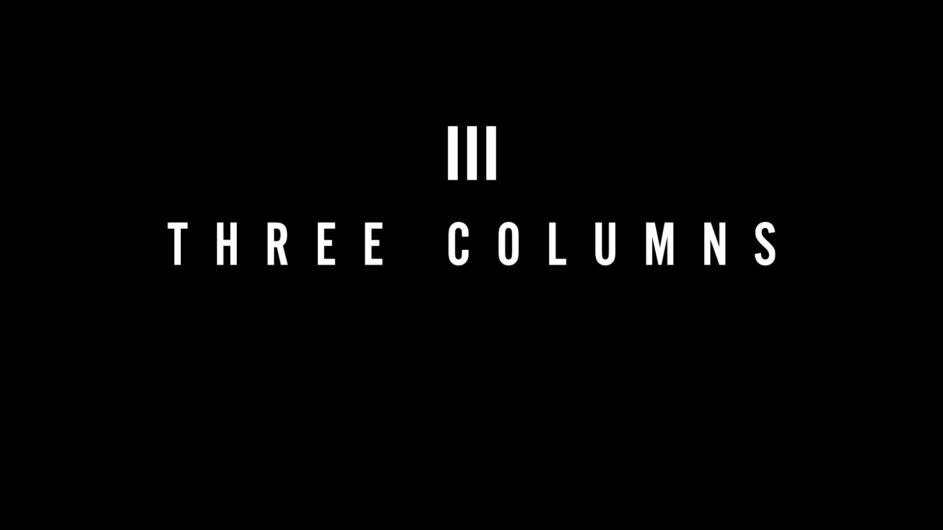
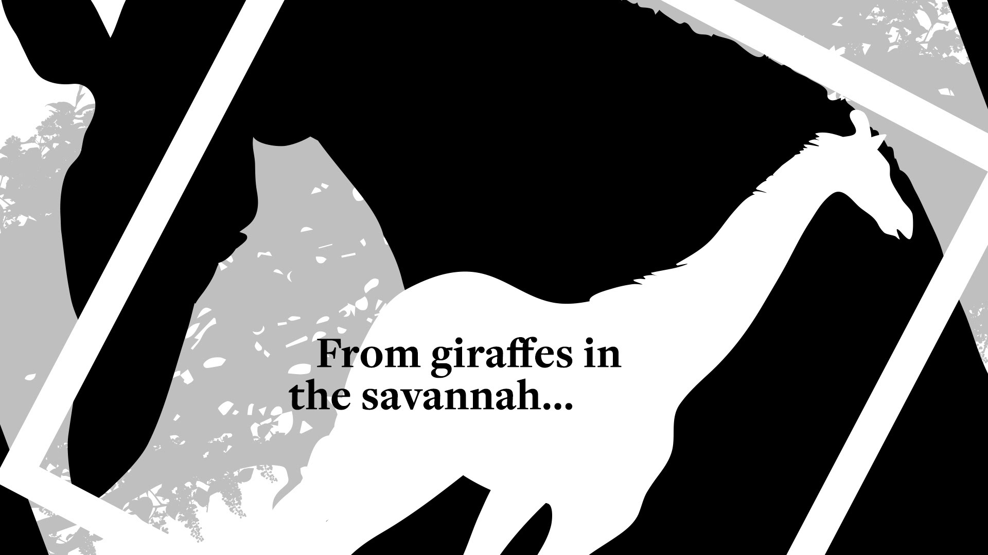
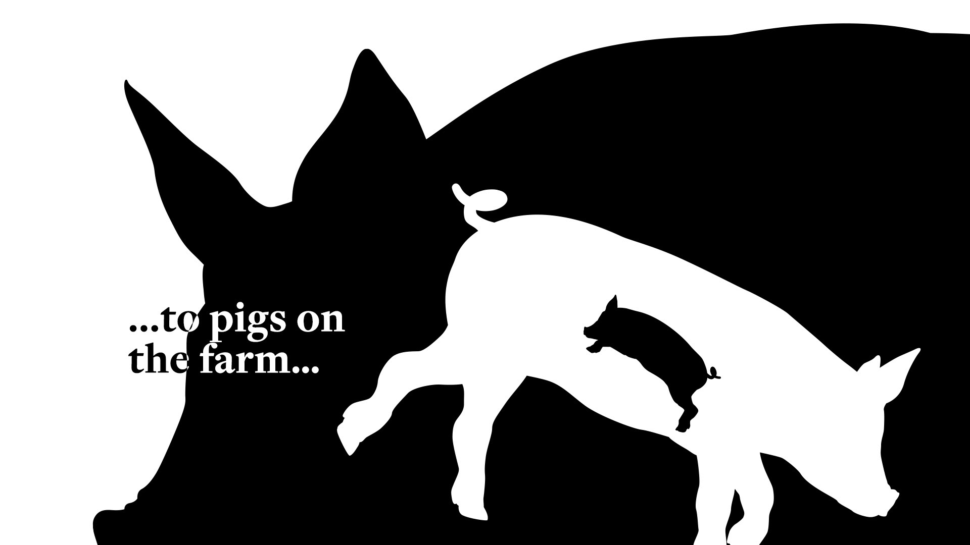
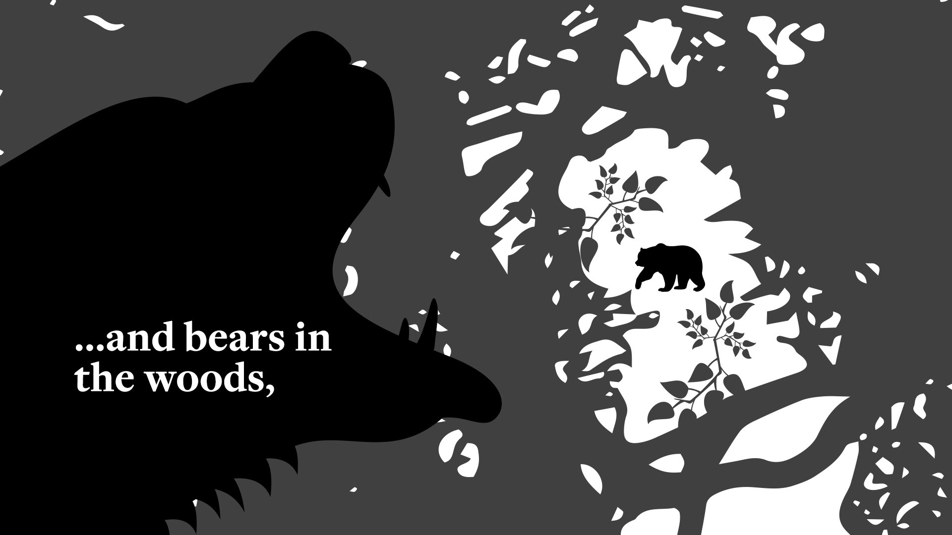
Create a sequence of design frames that showcases the film’s key production members and Three Spheres logo. There were no shot scenes for the opening sequence, so one had to use the film’s three columns symbol as an element to weave through the frames.


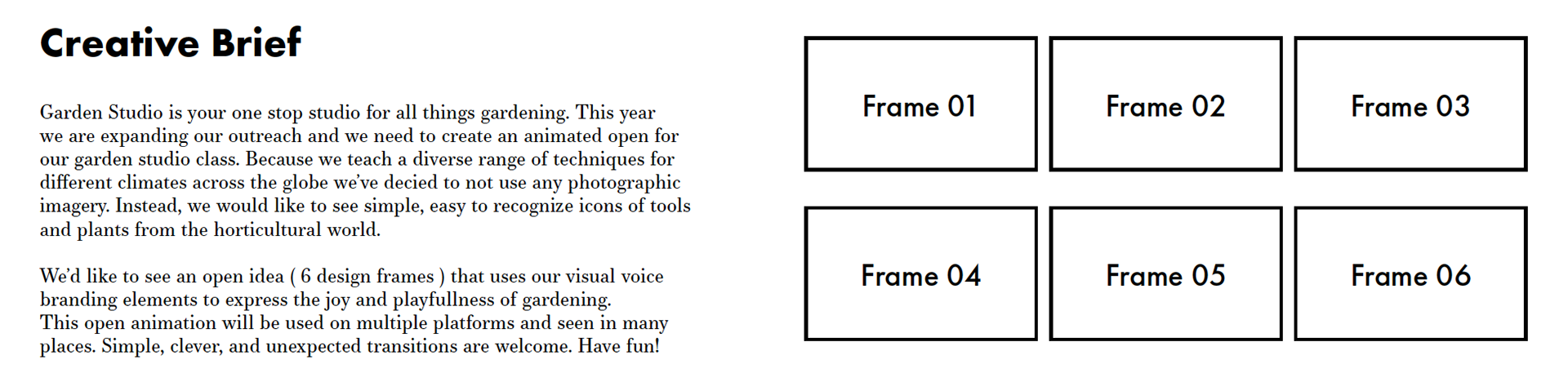
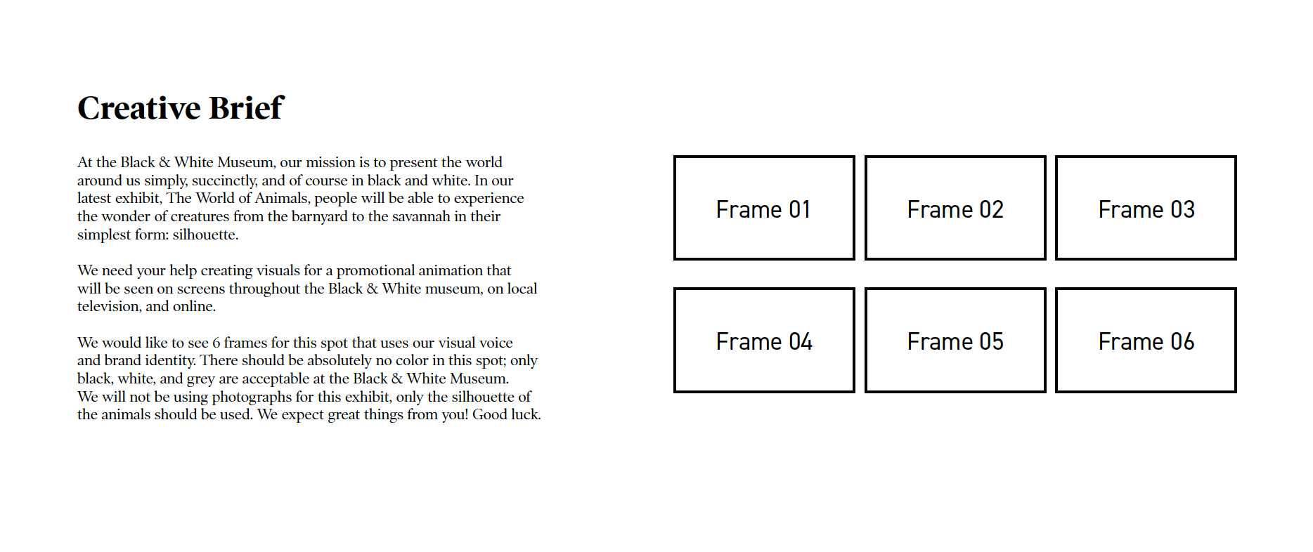
Continuing on, and to reinforce the learning of figure-ground relationships, one was presented with this creative brief:
And here is my resulting presentation deck.


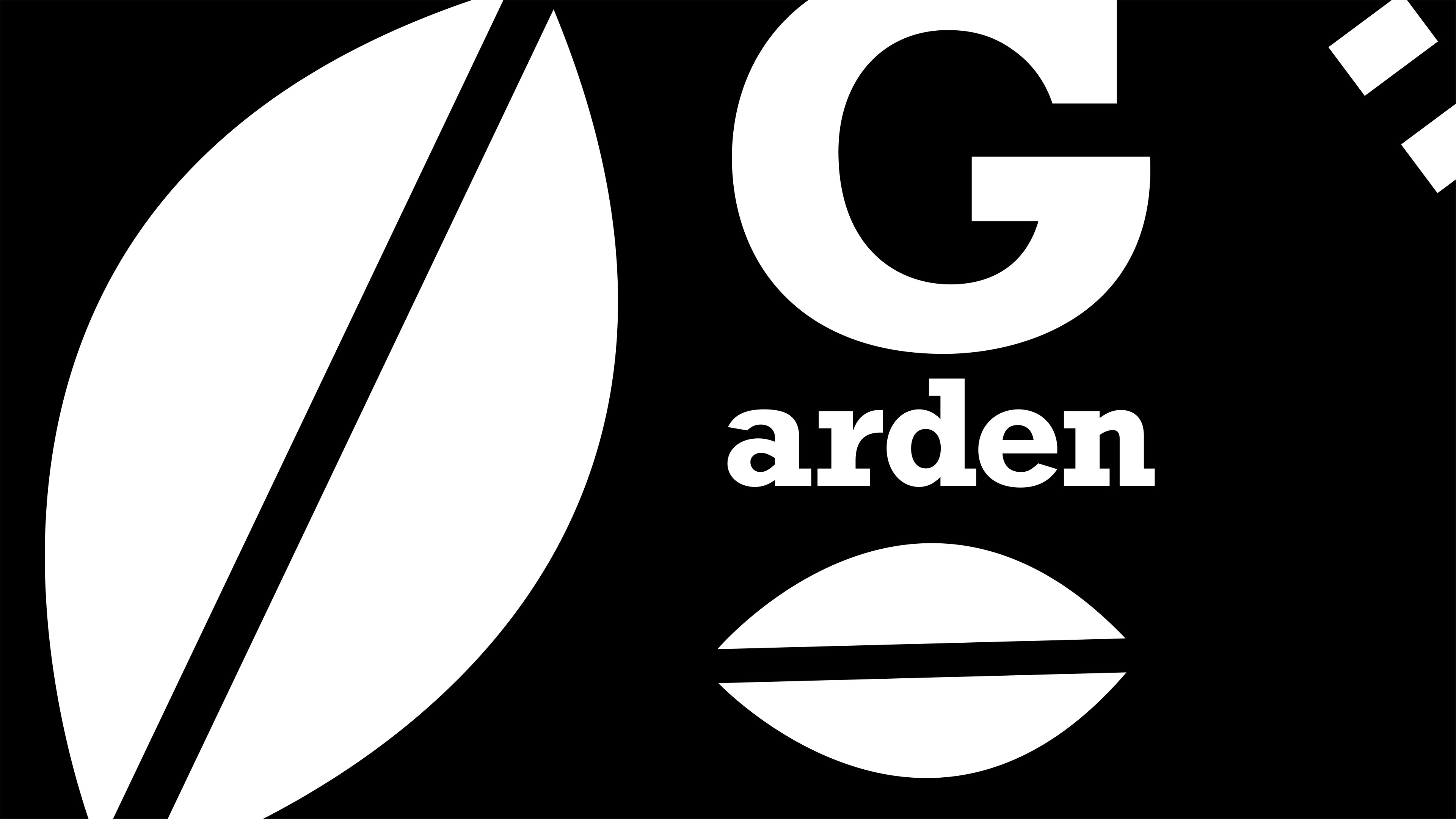
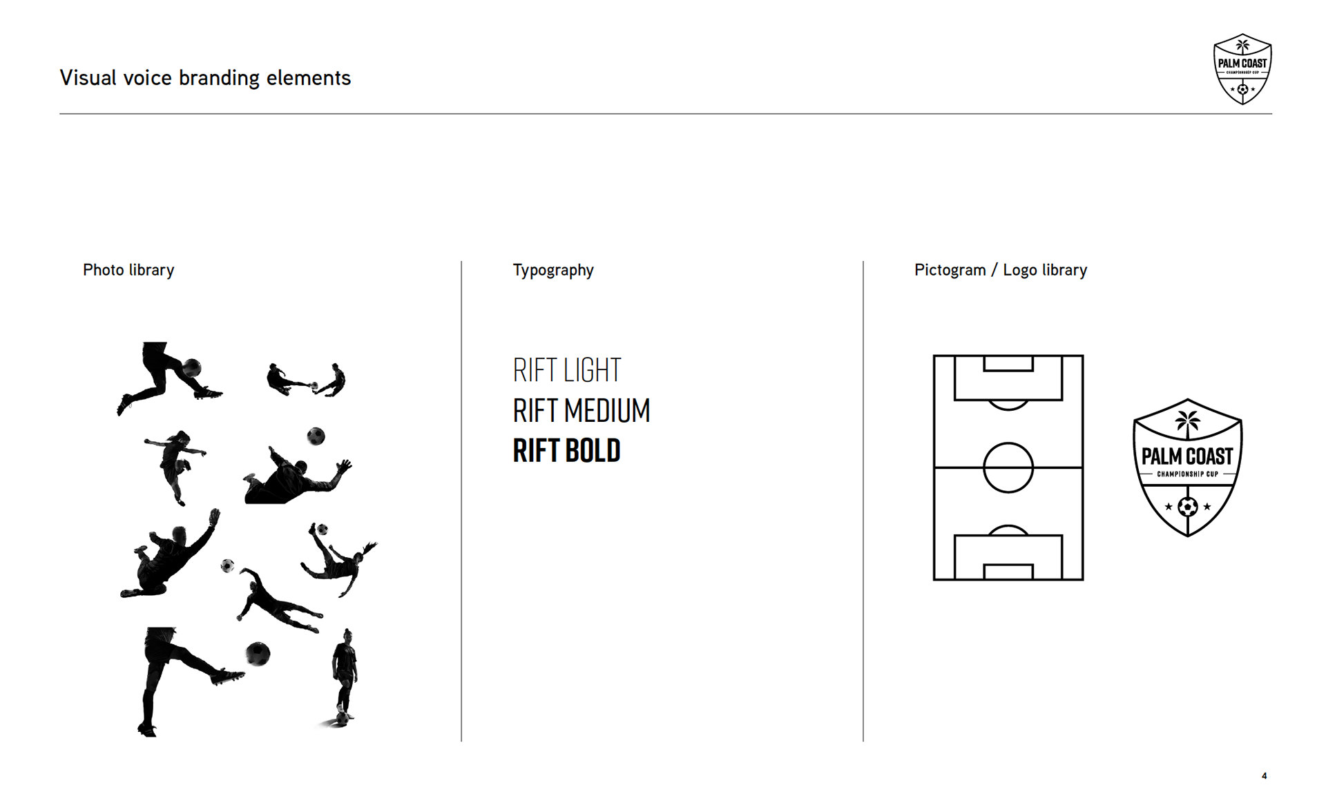
And another brief, with the accompanying visual branding elements.
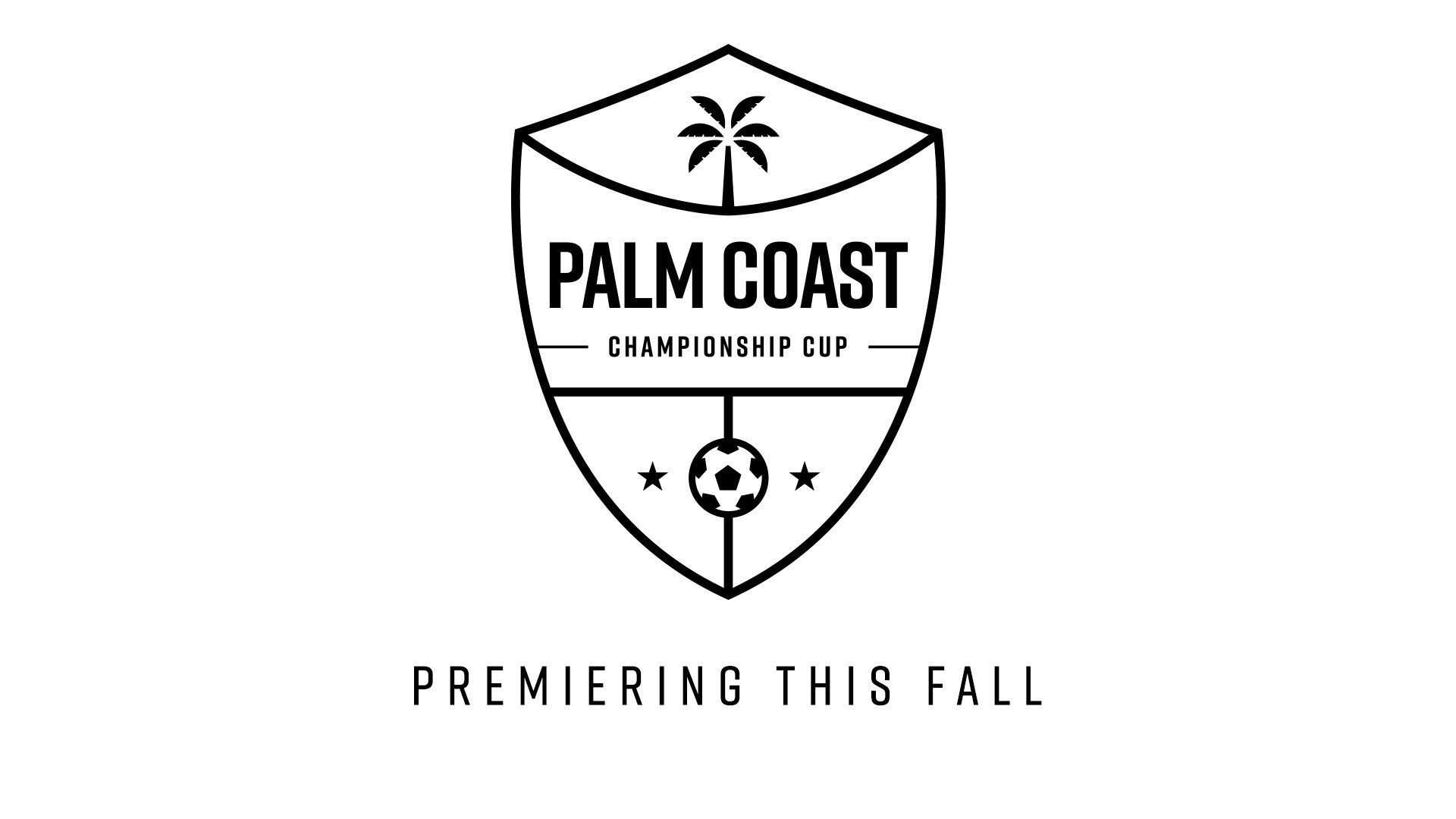
And here are the resulting design frames I created.


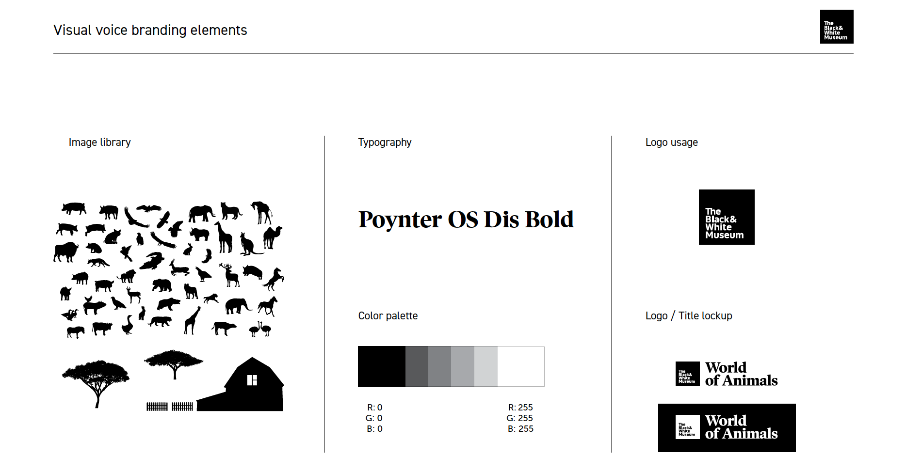
The next part of the course focused on how to emphasize important elements; the importance of creating good value structure; and basic colour theory. So here are the creative brief and visual branding elements.
And here are my design frames.


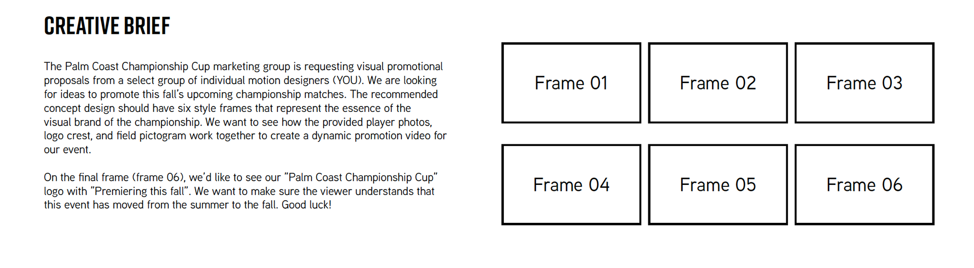
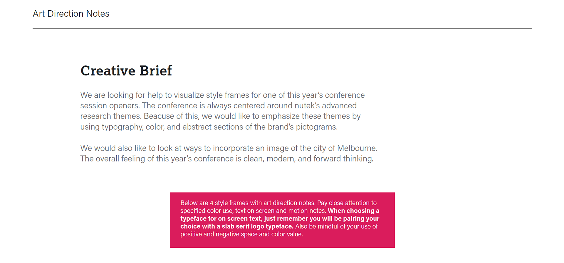
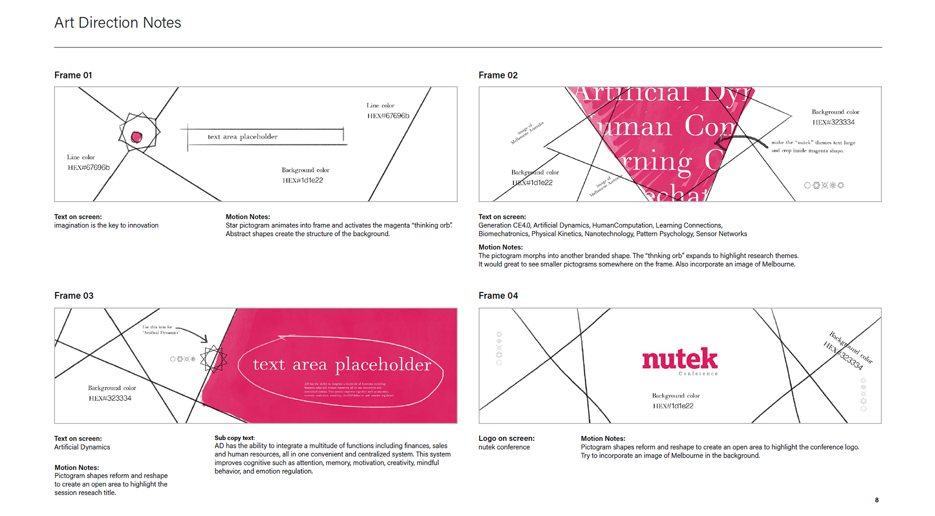
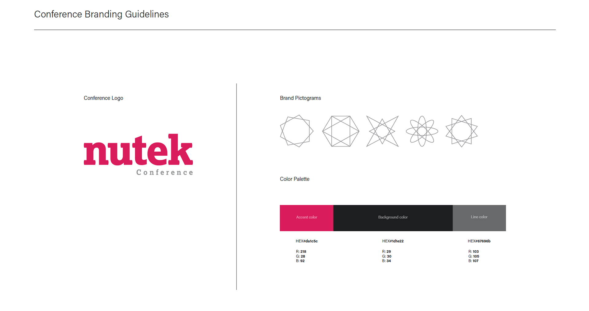
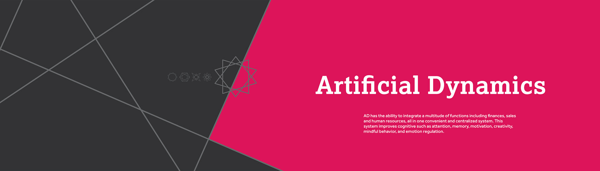
Diving into a more 'real world' example now. Below are the brief, branding guidelines, and art direction notes.
And the resulting designs.


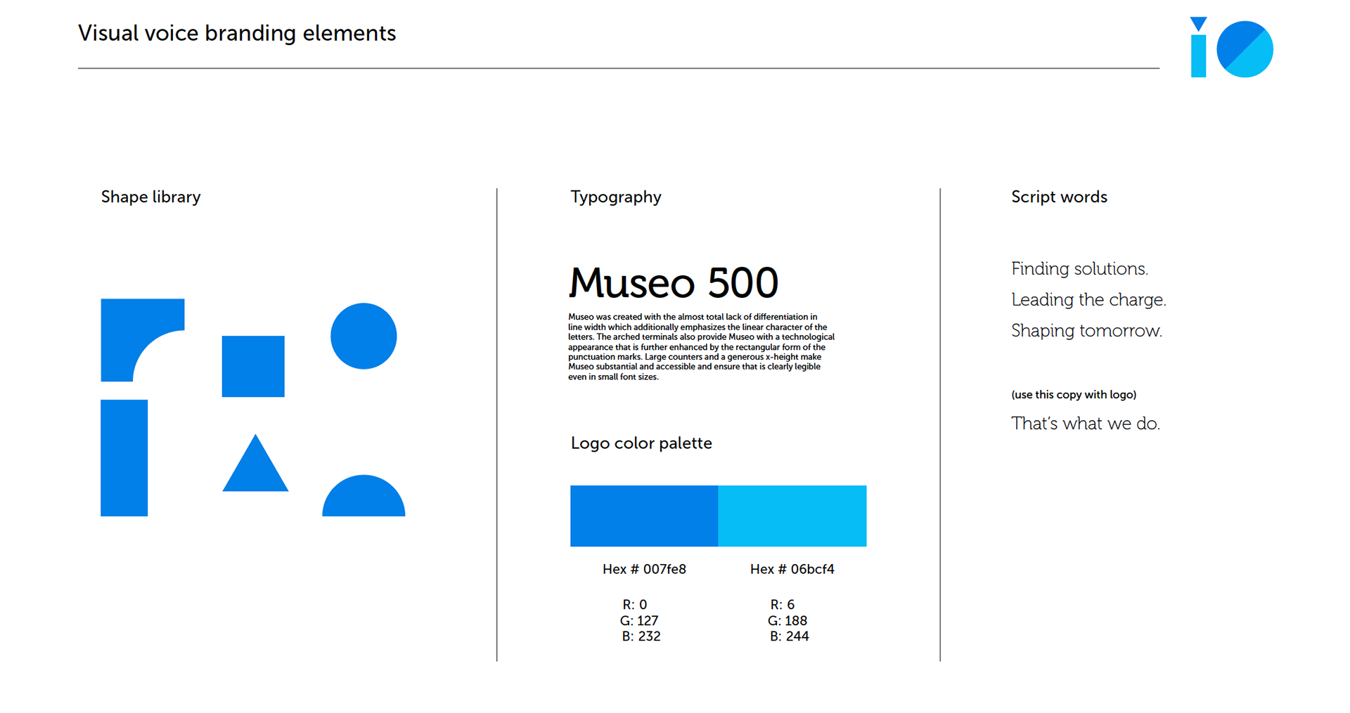
The goal here is to show you how I interpret a brief, art direction and branding guidelines. Below is the brief etc for a company called iO - who provide solutions for their customers that meet the demands of an ever changing world.
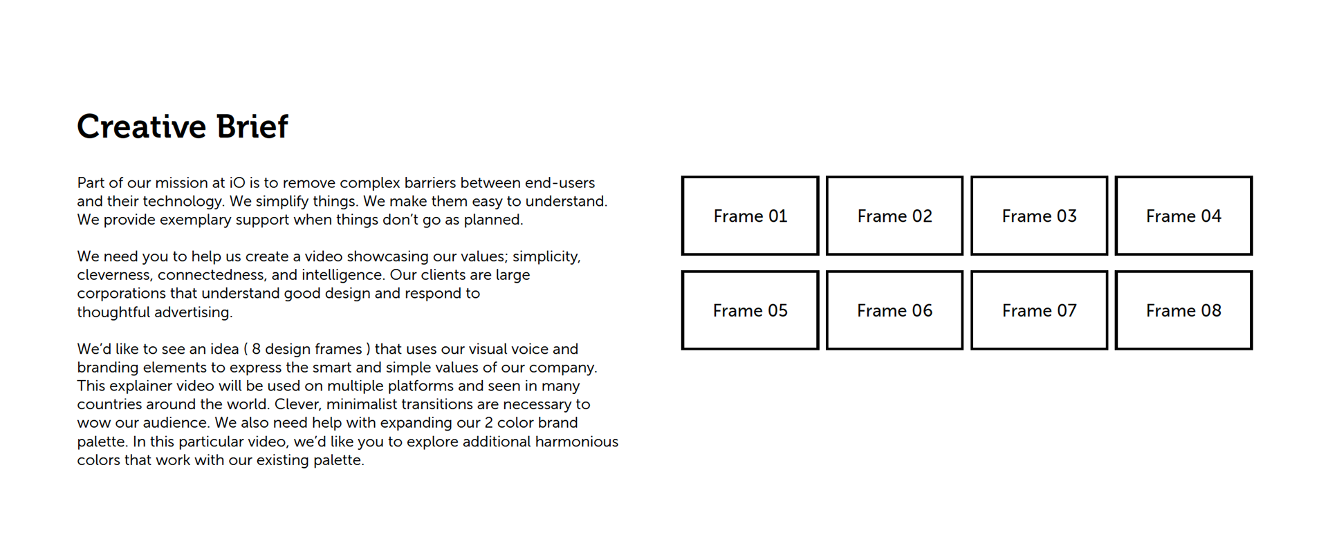
And here are my design frames for this project.